Hazard assessment: Visualise climate indicators (change in projection)#
A workflow from the CLIMAAX Handbook and MULTI_HAZARD GitHub repository.
See our how to use risk workflows page for information on how to run this notebook.
Preparation Work#
Load libraries#
import os

import cartopy.crs as ccrs
import cartopy.feature as cfeature
from cartopy.mpl.ticker import LongitudeFormatter, LatitudeFormatter
import matplotlib.pyplot as plt
import numpy as np
import xarray as xr
Area of interest#
region_name = 'IT'
Path configuration#
# Path to the folders containing the NetCDF files
indicators_ref_path = f'data_{region_name}/indicators/cordex-hist'
indicators_future_path = {
    '2021-2050': f'data_{region_name}/indicators/cordex-45-near',
    '2041-2070': f'data_{region_name}/indicators/cordex-45-mid',
    '2071-2100': f'data_{region_name}/indicators/cordex-45-far',
}

# Path to save the maps
output_maps = f'data_{region_name}/indicators/maps_change'
os.makedirs(output_maps, exist_ok=True)
Set indicators_ref_path to the indicators folder for the reference dataset.
This is usually the historical period of the model run also that produced the projections.
indicators_future_path is intended to map different future periods/scenarios/etc. to their respective indicators folder.
The keys can be freely chosen and will be used to label the datasets in plot titles.
Tip
For the example shown in the default configuration, the compute climate indicators notebook was run multiple times:
once for the historical period of a EURO-CORDEX model and
three more times for each of the 2021-2050 (near future), 2041-2070 (medium future), and 2071-2100 (far future) periods of the same CORDEX model run for the RCP4.5 scenario.
This produced four separate indicators folders whose contents are combined in this notebook.
Plotting helpers#
# Add this to every plot title:
global_title = 'RCP4.5'

def configure_map(ax, title=None):
    ax.add_feature(cfeature.COASTLINE)
    ax.add_feature(cfeature.BORDERS, linestyle='-', edgecolor='black')
    gl = ax.gridlines(draw_labels=True, linewidth=0.5, color='gray', alpha=0.0)
    gl.top_labels = False
    gl.right_labels = False
    gl.xformatter = LongitudeFormatter()
    gl.yformatter = LatitudeFormatter()
    if title is not None:
        ax.set_title(title, fontsize="medium")
def compute_change(indicator, relative=False):
    changes = []
    reference = xr.open_dataset(os.path.join(indicators_ref_path, indicator))
    # Load each of the specified future periods and join along a new coordinate
    for period, path in indicators_future_path.items():
        future = xr.open_dataset(os.path.join(path, indicator))
        change = (future - reference)
        if relative:
            change /= reference
        changes.append(change.expand_dims({'period': [period]}))
    return xr.concat(changes, dim='period')
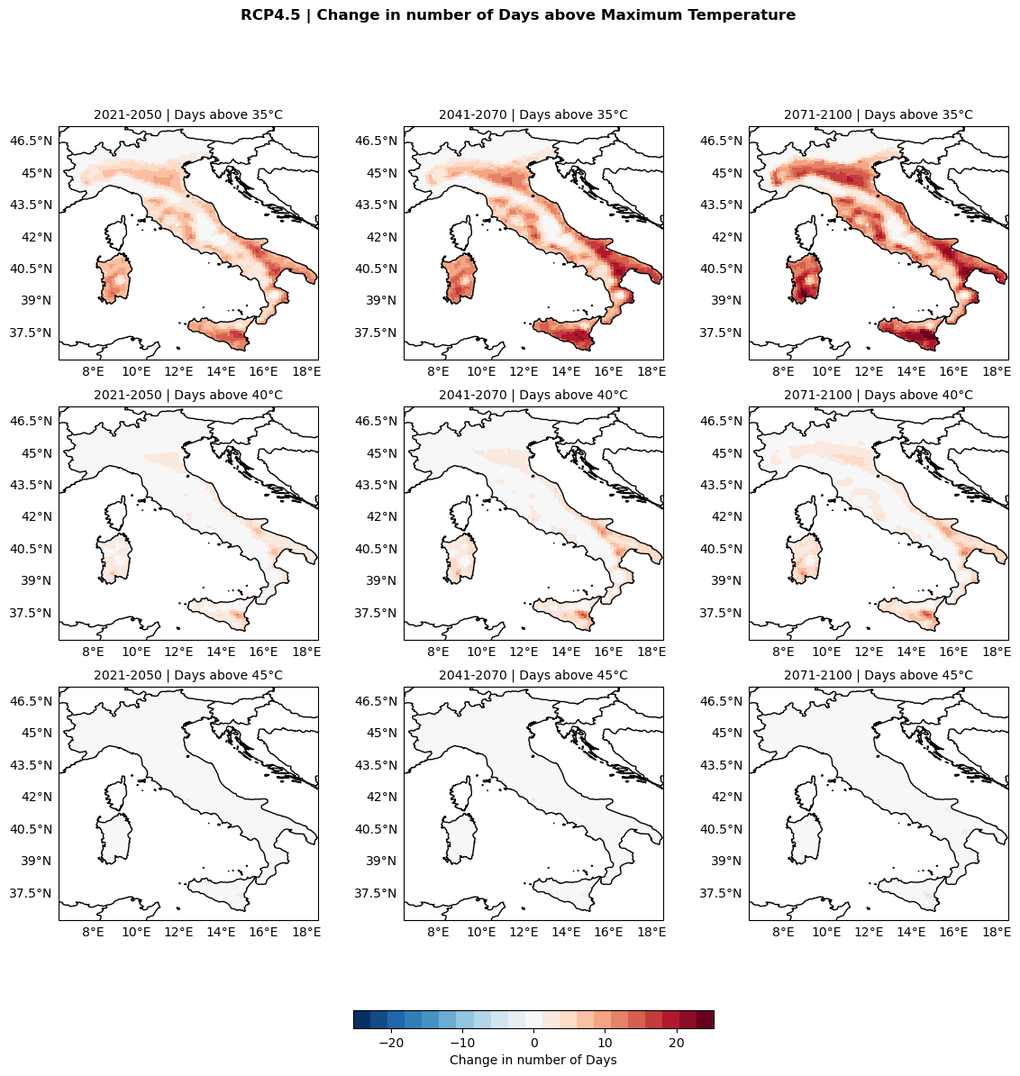
Change in number of days above 35°, 40° and 45°C#
thresholds = [35, 40, 45]  # °C

tx_change = xr.concat(
    [compute_change(f'Temp_DaysAbove{threshold}.nc').expand_dims({'threshold': [threshold]}) for threshold in thresholds],
    dim='threshold'
)['tx_days_above']
fig, axss = plt.subplots(nrows=len(thresholds), ncols=len(indicators_future_path),
        figsize=(14, 13), subplot_kw={'projection': ccrs.PlateCarree()})
fig.suptitle(f'{global_title} | Change in number of Days above Maximum Temperature', fontweight='bold')

# Ensure symmetric colorbar range
lim = np.abs(tx_change).max()
plot_kwargs = {
    'cmap': plt.get_cmap('RdBu_r', 21),
    'vmin': -lim,
    'vmax': lim,
    'transform': ccrs.PlateCarree()
}

# Rows: temperature thresholds
for axs, threshold in zip(axss, thresholds):
    # Columns: future periods/scenarios/etc.
    for ax, period in zip(axs, indicators_future_path):
        configure_map(ax, title=f'{period} | Days above {threshold}°C')
        da = tx_change.sel(period=period, threshold=threshold)
        im = ax.pcolormesh(da['longitude'], da['latitude'], da, **plot_kwargs)

fig.colorbar(im, ax=axss, orientation='horizontal', fraction=0.02, pad=0.1, label='Change in number of Days')

fig.savefig(os.path.join(output_maps, "Temp_DaysAbove_change.png"))
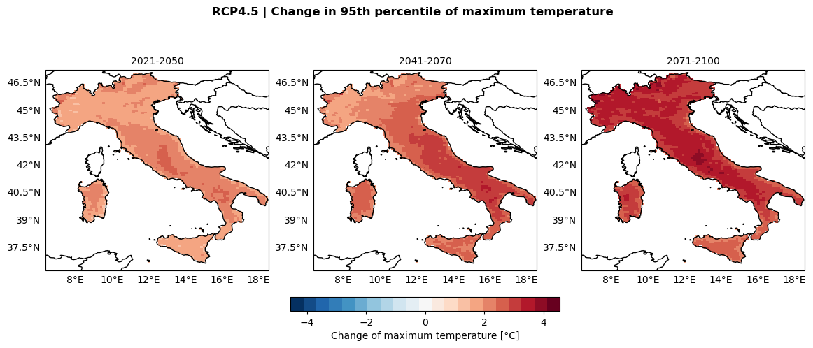
Change in 95th temperature percentile#
tmax_change = compute_change(f'Temp_P95.nc')["tmax2m"] # substitute for other percentiles as required
fig, axs = plt.subplots(nrows=1, ncols=len(indicators_future_path),
        figsize=(14, 5), subplot_kw={'projection': ccrs.PlateCarree()})
fig.suptitle(f'{global_title} | Change in 95th percentile of maximum temperature', fontweight='bold')

lim = np.abs(tmax_change).max()
plot_kwargs = {
    'cmap': plt.get_cmap('RdBu_r', 21),
    'vmin': -lim,
    'vmax': lim,
    'transform': ccrs.PlateCarree()
}

for ax, period in zip(axs, indicators_future_path):
    configure_map(ax, title=period)
    da = tmax_change.sel(period=period)
    im = ax.pcolormesh(da['longitude'], da['latitude'], da, **plot_kwargs)

fig.colorbar(im, ax=axs, orientation='horizontal', fraction=0.05, pad=0.1, label='Change of maximum temperature [°C]')

fig.savefig(os.path.join(output_maps, "Temp_P95_change.png"))
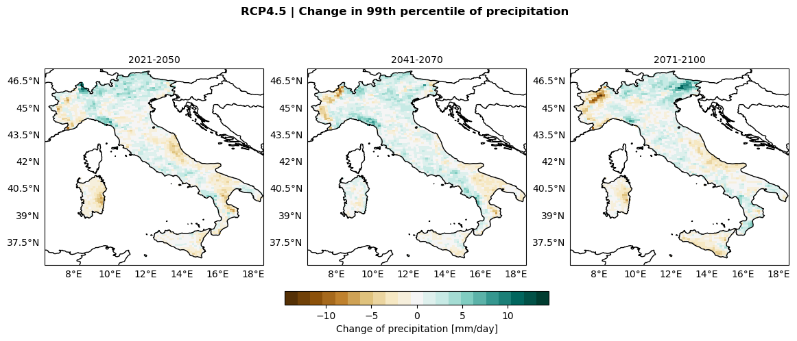
Change in precipitation percentiles#
precip_change = compute_change(f'Precip_P99.nc')["tp"] # substitute for other percentiles as required
fig, axs = plt.subplots(nrows=1, ncols=len(indicators_future_path),
        figsize=(14, 5), subplot_kw={'projection': ccrs.PlateCarree()})
fig.suptitle(f'{global_title} | Change in 99th percentile of precipitation', fontweight='bold')

lim = np.abs(precip_change).max()
plot_kwargs = {
    'cmap': plt.get_cmap('BrBG', 21),
    'vmin': -lim,
    'vmax': lim,
    'transform': ccrs.PlateCarree()
}

for ax, period in zip(axs, indicators_future_path):
    configure_map(ax, title=period)
    da = precip_change.sel(period=period)
    im = ax.pcolormesh(da['longitude'], da['latitude'], da, **plot_kwargs)

fig.colorbar(im, ax=axs, orientation='horizontal', fraction=0.05, pad=0.1, label='Change of precipitation [mm/day]')

fig.savefig(os.path.join(output_maps, "Precip_P99_change.png"))
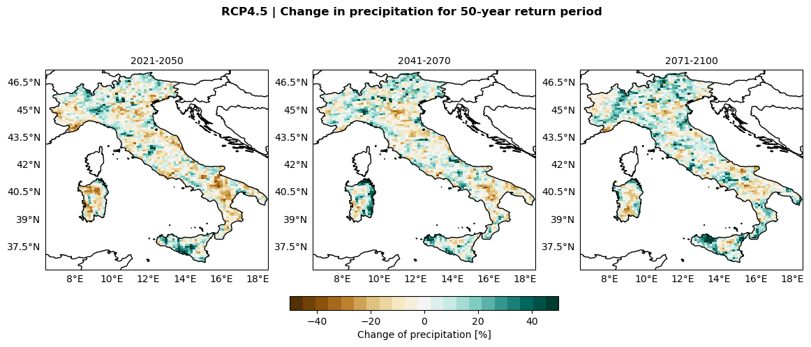
Percentage change in precipitation return levels#
precip_rp_change = compute_change(f'Precip_return_levels_gumbel.nc', relative=True)['return_period_50_y']
fig, axs = plt.subplots(nrows=1, ncols=len(indicators_future_path),
        figsize=(14, 5), subplot_kw={'projection': ccrs.PlateCarree()})
fig.suptitle(f'{global_title} | Change in precipitation for 50-year return period', fontweight='bold')

lim = np.abs(precip_rp_change).max()
plot_kwargs = {
    'cmap': plt.get_cmap('BrBG', 21),
    'vmin': -50,
    'vmax': 50,
    'transform': ccrs.PlateCarree()
}

for ax, period in zip(axs, indicators_future_path):
    configure_map(ax, title=period)
    da = 100. * precip_rp_change.sel(period=period)
    im = ax.pcolormesh(da['longitude'], da['latitude'], da, **plot_kwargs)

fig.colorbar(im, ax=axs, orientation='horizontal', fraction=0.05, pad=0.1, label='Change of precipitation [%]')

fig.savefig(os.path.join(output_maps, "Precip_return_levels_change.png"))