Risk assessment for heatwaves based on satellite-derived data#
A workflow from the CLIMAAX Handbook and HEATWAVES GitHub repository.
See our how to use risk workflows page for information on how to run this notebook.
Under climate change, the occurrence of heatwaves is expected to increase in the future in Europe. The main negative impacts caused by heatwave events are related to the overheating of the urban areas, which lowers the comfort of living or causes health issues among vulnerable population (see also: Integrated Assessment of Urban Overheating Impacts on Human Life), drought, and water scarcity. Nowadays, there are a lot of studies and methodologies on how we can mitigate the impacts of these events. This toolbox wants to answer simple questions that are more frequently asked by crisis management local authorities, urban planners, or policymakers.
These questions are:
What are the problematic areas? (most overheated areas)
Who or what is exposed?
This workflow contains the following steps used to generate a risk map for your selected area:
Preparatory work: installing packages and creating directory structure
Understanding the trends in the occurence of hot days in the climate change scenarios
Identifying the heat islands (areas most exposed to heat) in your selected area, based on the observed land surface temperature (from RSLab Landsat8, resolution: 30x30m)
Analysing the distribution of vulnerable population, based on population distribution data.
Creating a heatwave risk map based on the risk matrix where risk = (level of exposure to heat in the area) x (level of vulnerability)
Preparation work#
Prepare your workspace#
In this notebook we will use the following Python libraries:
zipfile - Working with ZIP archive files.
os - Handling the current working directory.
glob - Unix style pathname pattern expansion.
datetime - Handling dates and times.
numpy - 2-3D array data handling.
xarray - 2-3D array data handling.
pandas - Tabular data handling.
rasterio - NetCDF and raster processing.
geopandas - Geospatial data handling.
matplotlib - Data plotting.
ipyleaflet - Interactive maps in Jupyter notebooks.
ipywidgets - Creating interactive HTML widgets.
localtileserver - Creating tile layers for maps.
plotly - Creating interactive plots.
import zipfile
import os
from glob import glob
from datetime import datetime

import numpy as np
import xarray as xr
import pandas as pd
import rasterio
import geopandas as gpd

import matplotlib.pyplot as plt
from ipyleaflet import Map, LayersControl, WidgetControl
import ipywidgets as widgets
from localtileserver import get_leaflet_tile_layer, TileClient
import plotly.express as px
# Set host forwarding for remote jupyterlab sessions
if 'JUPYTERHUB_SERVICE_PREFIX' in os.environ:
    os.environ['LOCALTILESERVER_CLIENT_PREFIX'] = f"{os.environ['JUPYTERHUB_SERVICE_PREFIX']}/proxy/{{port}}"
Create directory structure#
# Define the directory for the flashflood workflow preprocess
workflow_folder = 'Heatwave_risk'

# Define directories for data and results within the previously defined workflow directory
data_dir = os.path.join(workflow_folder, 'data')
LST_dir = os.path.join(data_dir, 'LST')
pop_dir = os.path.join(data_dir, 'population')
results_dir = os.path.join(workflow_folder, 'results')

# Create the workflow directory along with subdirectories for data and results
for path in [workflow_folder, data_dir, LST_dir, pop_dir, results_dir]:
    os.makedirs(path, exist_ok=True)
Understanding trends in the occurence in hot days/nights under climate change#
Data from climate models (EURO-CORDEX or CMIP6) is too coarse to be used directly in an assessment of overheated areas in urban environment. However, in a climate risk assessment, it is important to understand the influence of climate change on the probability of heatwave occurrence in the future relative to the present climate. You can use the results from the heatwave hazard assessment workflow (applied to your area) or use other data sources available online, where heatwave occurance data is provided on regional level.
On the website of Climate-ADAPT we can find information on the future occurrence of hot days at NUTS2 level. The content in the European Climate Data Explorer pages is delivered by the Copernicus Climate Change Service (C3S) implemented by ECMWF. You can explore this data in the following links:
Identify overheated areas in the urban environment#
Data description#
Heat islands are urbanized areas that experience higher temperatures than surrounding areas. Structures such as buildings, roads, and other infrastructure absorb and re-emit the sun’s heat, thus resulting in warmer temperatures than in the natural landscapes (such as forests and water bodies). Urban areas, where these structures are highly concentrated and greenery is limited, become “islands” of higher temperatures relative to outlying areas (see also: Heat islands definition). For the identification of the heat islands from the historical data we can use these data:
Satellite-derived land surface temperature data in this workflow is based on land surface temperature (LST) calculated from Landsat 8 or 9 imagery (spatial resolution: 15-30m; at 8-16 days interval). We use this data product for the identification of heat islands.
Obtain land surface temperature#
LST data is available from the RSLab website (option 1) or can be calculated here from the Landsat imagery bands (option 2).
Tip
Pick your preferred option to obtain the LST data and skip over the cells of the other.
Option 1: download LST from the RSLab portal#
Land surface temperature data needs to be manually downloaded from the RSLab portal. To do this, you need to follow these steps:
Go to the RSLab portal and draw a closed polygon around your area of interest by zooming in and clicking on the map. If you are focusing on urban areas, it is important to try to select only the urban areas in the rectangular polygon. You may encounter “Very big request” errors when selecting areas larger than the allowed limit or for complex selections (too many polygon vertices - try a simple bounding box instead).
Select the time period, e.g. June to August in a specific year, where particularly high temperatures were observed. From Landsat8, data is available for 2013-2024, it is recommended to choose a year in this period (optional: consult the local meteorological authorities for more information on past heat waves).
Select your preferred Landsat source and emissivity. For the dates in the period 2013-2024, please choose Landsat8 as the source. For urban areas, it is recommended to use MODIS and NDVI-based emissivity (ASTER emissivity is preferred for natural landscapes). Refer to the documentation for more details.
Click the “Calculate LST” button.
The results will be presented below the map. For each LST result you will find a “show” and “download” buttons. “Show” button allows to display the LST as a layer on the map and calculates the mean/min/max LST value for the selected image.
To dowload the images, please press “Download - All images”, this will start the download of the “AllImages_LST.zip” file that contains .tiff images.
Once downloaded, please move the downloaded file to the folder specified above under variable LST_dir (folder ./Heatwave_risk/data_dir/LST).
This code unzips all downloaded LST data:
# Loop through all files in the directory
for file in os.listdir(LST_dir):
    file_path = os.path.join(LST_dir, file)
    # Check if the file is a zipfile
    if zipfile.is_zipfile(file_path):
        # Open the zipfile
        with zipfile.ZipFile(file_path, 'r') as zip_ref:
            # Extract all contents of the zipfile into the working directory
            zip_ref.extractall(LST_dir)
Option 2: download Landsat 8 & 9 imagery and calculate LST#
While the public RSLab data portal provides convenient access to Landsat-derived land surface temperature values, it imposes restrictions on the size of the region for which data is downloaded. Alternatively, we can access Landsat imagery directly, e.g., via the US Geological Survey (USGS) Machine to Machine (M2M) interface and compute LST ourselves. Download volumes following this option are much larger (approx 1.3 GB per Landsat scene) compared to the direct download of LST from the RSLab data portal, but allow for the processing of larger regions.
We use the eodag package to search the USGS catalogue for Landsat collection 2 level 1 products and download them. The data access requires credentials to access the USGS M2M interface. An account with USGS can be registered here.
Land surface temperature is calaculated with the pylandtemp package.
import eodag
import pylandtemp

# Output folder for Landsat data
landsat_dir = os.path.join(data_dir, "landsat")
Before querying the USGS data catalogue, you have to configure the usgs source of eodag to use your account credentials.
If choosing a yaml-file based configuration, an entry such as
usgs:
  api:
    credentials:
      username: ...
      password: ...
must be added with your account credentials. See the eodag configuration documentation for all configuration options.
Attention
Since February 2025, the USGS M2M only accepts token-based authentication. Put your access token in the password field for eodag.
The
credentialsin the eodag configuration file for theusgsprovider must be placed under theapientry (notauthas used by some other providers).If you are seeing
UnsupportedProvidererrors when searching for products, it can indicate that theusgsprovider for eodag is not correctly set up in your configuration.
dag = eodag.EODataAccessGateway() # also accepts a path to a configuration file as an argument
We search the catalogue for matching Landsat Collection 2 Level 1 (LANDSAT_C2L1) products:
geomdefines the area of interest. Here, lat-lon coordinates of a bounding box are given, but a shapely geometry object would also be accepted. Alternatively, a recognized location can be specified with thelocationsparameter. See the documentation of search_all() for more information.A time period is selected with the
startandendparameters.We fix the data provider here to USGS, but other providers of Landsat data may be available to you. Run
dag.available_providers("LANDSAT_C2L1")to find alternatives.
# Bounding box for the area of interest
area = {
    "lonmin": 18.65, "lonmax": 18.85,
    "latmin": 49.16, "latmax": 49.27
}

products = dag.search_all(
    productType="LANDSAT_C2L1",
    geom=area,
    start="2015-06-01",
    end="2015-08-31",
    provider="usgs"
)
Tip
The example is configured to download a single year only, but data from multiple years can be selected. Products then may require additional filtering, e.g., to only include scenes from summer months.
Only consider images that fully contain our region of interest (minimum overlap = 100%):
products = products.filter_overlap(geometry=area, minimum_overlap=100)
Products selected for further processing:
products
Download each product, only keep values for cloud-free pixels, clip to the region of interest and reproject to lat-lon coordinate system for the calculation of land surface temperature:
for product in products:

    # Download Landsat product (previously downloaded products will be reused)
    product_outdir = product.download(output_dir=landsat_dir, extract=True, delete_archive=True)

    # Create a dataset from the bands required to compute LST, reproject to lat-lon coords
    # and clip to the area of interest (TODO: consider using eodag-cube's get_data)
    product_data = open_and_preprocess(
        product_outdir,
        bands=[4, 5, 10, 11],
        mask_clouds=True,
        crs="EPSG:4326",
        clip_bbox=[area["lonmin"], area["latmin"], area["lonmax"], area["latmax"]]
    )

    # Compute land surface temperature with one of pylandtemp's algorithms
    product_lst = compute_land_surface_temperature(product_data)

    # Save LST such that it can be read in the same way as the data obtained in option 1
    product_date = datetime.fromisoformat(product.properties["startTimeFromAscendingNode"])
    product_lst.rio.to_raster(os.path.join(LST_dir, f"LST.{product_date:%Y%m%d_%H%M%S}.tif"), driver="gtiff")
Note
The output land surface temperature data is written by the code above such that it is compatible with the RSLab products. From here on, further processing in the workflow is identical for both options.
Preprocessing#
The code below extracts all dates from LST data files:
# This code extraxcts all dates from LST tif.files
# Create a list of file paths to your LST files using glob
L8list = glob(f"{LST_dir}/*LST*.tif")
# Initialize an empty list to store the datetime objects
lst_dates = []
# Loop through each filename
for file in L8list:
    # Extract the filename without the directory path
    filename = file.split('/')[-1]
    # Extract the date and time part from the filename
    if "AllImages_LST" in filename:
        date_time_str = filename.split('.')[1]
        date_str = date_time_str.split('_')[0]
        time_str = date_time_str.split('_')[1]
    else:
        date_str = filename[4:12]  # Extract date part directly
        time_str = filename[13:19]  # Extract time part directly
    # Combine date and time strings into a single string
    datetime_str = date_str + '_' + time_str
    # Convert the combined datetime string to a datetime object
    datetime_obj = datetime.strptime(datetime_str, '%Y%m%d_%H%M%S')
    # Append the datetime object to the lst_dates list
    lst_dates.append(datetime_obj)

lst_dates
[datetime.datetime(2015, 7, 12, 0, 0),
 datetime.datetime(2015, 7, 28, 0, 0),
 datetime.datetime(2015, 8, 29, 0, 0),
 datetime.datetime(2015, 8, 13, 0, 0),
 datetime.datetime(2015, 7, 19, 0, 0),
 datetime.datetime(2015, 8, 4, 0, 0),
 datetime.datetime(2015, 8, 20, 0, 0)]
This code will create a raster stack from all downloaded data:
# Load the data and create a raster stack from all maps
with rasterio.open(L8list[0]) as src0:
    meta = src0.meta

meta.update(count=len(L8list))
# Save a data to working directory
with rasterio.open(f'{data_dir}/L8_raster_stack.tif', 'w', **meta) as dst:
    for id, layer in enumerate(L8list, start=1):
        with rasterio.open(layer) as src1:
            dst.write_band(id, src1.read(1))
This code calculates mean values from the LST rasters which are not significantly influenced by clouds:
# Open the raster stack
stack_path = f'{data_dir}/L8_raster_stack.tif'
raster_dataset = xr.open_dataset(stack_path)

# Count the number of pixels greater than 0 for each band
num_pixels_gt_zero = (raster_dataset > 0).sum(dim=('x', 'y'))

# Calculate the total number of pixels for each band
total_pixels = raster_dataset.sizes['x'] * raster_dataset.sizes['y']

# Calculate the proportion of pixels greater than 0
prop_gt_zero = num_pixels_gt_zero / total_pixels

# Filter bands where at least 50% of pixels are greater than 0
filtered_bands = raster_dataset.where(prop_gt_zero >= 0.5)

# Calculate the mean values for the filtered bands
mean_values_filtered = filtered_bands.mean(dim=('x', 'y'))
#mean_values_filtered = mean_values_filtered.fillna(0)
mean_values_filtered = mean_values_filtered['band_data']
mean_values_list = mean_values_filtered.values.tolist()
For advanced users: how To calculate the LST from raw Landsat8-9 imagery.
You can also retrieve LST data by calculating it directly from the raw Landsat8 imagery. Please check the following resources:
Landsat8 raw imagery download: go to USGS and download the Landsat8 or 9, colection 2 level 1.
How to calculate LST (YouTube video). The YouTube video provides you with these equations for the calculation of the LST:
# Radiance
rad = 0.00033420 * b10 + 0.1

# Brightest temperature
bt = 1321.0789/np.log(774.8853/rad + 1)-272.15

# Normalized difference vegetation index
ndvi = (b5-b4)/(b5+b4)
ndvi_min = ndvi.min(skipna=True)
ndvi_max = ndvi.max(skipna=True)

# Proportion of the Vegetation
pv = ((ndvi +  ndvi_min)/(ndvi_max+ndvi_min))**2

# Emisivity
emi = 0.004*pv+0.986

# Land surface temperature
LST = (bt+1)+10.8*(bt/14380)*np.log(emi)
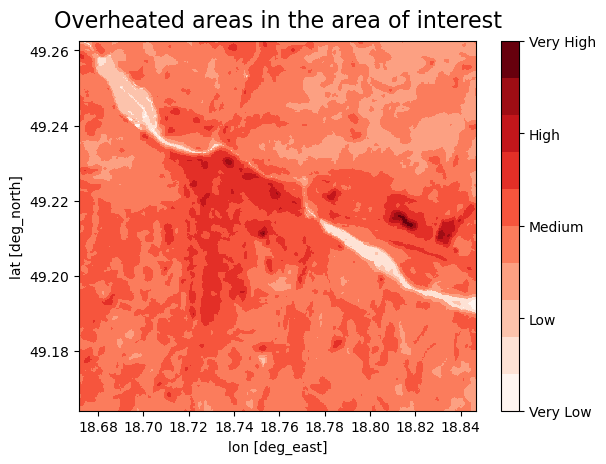
Classify based on the LST#
In this step, you reclassify the LST into 5 categories (Very low - Very high) based on the temperature, each category will contain two values, we divided the values into 10 groups because of the better sensitivity in the urban areas. You can change the treshold values for each category:
Very low < 20-25°C [values 1-2]
Low 25-35 °C [values 3-4]
Medium 35-45 °C [values 5-6]
High 45-55 °C [values 7-8]
Very High 55-60 <°C [values 9-10]
Note
If needed, you can change the threshold values for each category to see more of a difference between the different areas in the city.
Important
The LST values represent the surface temperature, not the air temperature. The surface temperature reaches higher values than the air temperature. The ground surface temperature is an important influencing factor for the weather as it is perceived by humans. The temperature of the ground surface can be more than 10°C higher than the air temperature on a sunny day, and up to 10°C below air temperature on clear nights when the surface loses heat by radiation. (see also: Land surface temperature vs air temperature).
# Define classes for grouping LST data
lc_bins = [20, 25, 30, 35, 40, 45, 50, 55, 60]  # Effect on the human health
lc_values = [1, 2, 3, 4, 5, 6, 7, 8, 9, 10]
# Load the data and calculate maximum values from raster stack
L8_path = f'{data_dir}/L8_raster_stack.tif'
L8 = xr.open_dataset(L8_path)
L8 = L8.max(dim='band', skipna=True, keep_attrs=True)
L8lst2016 = L8['band_data']
lstbbox = L8.rio.bounds()

# Function to reclassify data using numpy
def reclassify_with_numpy_ge(array, bins, new_values):
    reclassified_array = np.zeros_like(array)
    reclassified_array[array < bins[0]] = new_values[0]
    for i in range(len(bins) - 1):
        reclassified_array[(array >= bins[i]) & (array < bins[i + 1])] = new_values[i + 1]
    reclassified_array[array >= bins[-1]] = new_values[-1]
    return reclassified_array

# Apply the reclassification function
lc_class = reclassify_with_numpy_ge(L8lst2016.values, bins=lc_bins, new_values=lc_values)

# Convert the reclassified array back to xarray DataArray for plotting
lc_class_da = xr.DataArray(lc_class, coords=L8lst2016.coords, dims=L8lst2016.dims)

# Plot the data
fig, ax = plt.subplots()
cmap = plt.get_cmap('Reds', 10)
oa = lc_class_da.plot(ax=ax, cmap=cmap, add_colorbar=False)
cbar = fig.colorbar(oa, ticks=[1, 3.25, 5.5, 7.75, 10])
cbar.ax.set_yticklabels(['Very Low', 'Low', 'Medium', 'High', 'Very High'], size=10)
ax.set_xlabel('lon [deg_east]')
ax.set_ylabel('lat [deg_north]')
plt.title('Overheated areas in the area of interest', size=16, pad=10)
plt.show()
Plot LST#
We display the measured data of the 2m air temperature together with the LST data, to see for which days we downloaded the LST data.
This step will give us the information if we downloaded the data for the days with the highest air temperature.
# Create a dictionary from your data
data = {'Dates': lst_dates, 'Values': mean_values_list}
# Create a DataFrame from the dictionary
df = pd.DataFrame(data)

# Plot using Plotly Express
fig = px.scatter(df, x='Dates', y='Values', labels={'Dates': 'Date', 'Values': 'LST Mean Values'}, color='Values')
fig.update_traces(marker=dict(color='green'))  # Set dot color to green
fig.update_traces(mode='markers')  # Display as dots
# Add title and center it
fig.update_layout(title_text='LST mean values (cloud coverage<50%)',
                  title_x=0.5,  # Center the title horizontally
                  title_y=0.9)  # Adjust vertical position if needed
fig.update_xaxes(tickformat='%d-%m-%Y')
fig.show()
This plot gives you the information about land surface temperature mean values for the selected area, per Landsat image. Only the days corresponding to the LST pictures with cloud coverage lower then 50% are plotted.
Identify vulnerable population groups#
We can now use the maps of population distribution and combine these with LST maps to assess how the most populated areas overlap with the most overheated areas.
The default option in this workflow is to retreive the population data from the WorldPop dataset.
Using your own data for population and infrastructure
For a more accurate assessment, it is advisable to use local data for the vulnerable population. For example, for the Zilina pilot in the CLIMAAX project, we collected data from the Zilina municipality office about the buildings that are usually crowded with huge masses of people, e.g. hospitals, stadiums, main squares, big shopping centers, main roads, and bigger factories. If places like these are overheated, a huge number of people can be negatively influenced by the heat. Therefore, the risk also becomes higher and it would be most effective to prioritize these areas when working on heat mitigation measures.
Download the vulnerable population data#
Go to the Worldpop Hub (DOI: 10.5258/SOTON/WP00646) to access population data:
Enter a country in the search box at the top right of the table. You will find entries valid for different years.
Pick a year (choose the most recent if unsure) and click on Data & Resources next to the corresponding entry.
Download the maps for the most vulnerable groups of the population. This is done by downloading the relevant files from the Data files section of the entry selected above. The data files have names according to the following pattern:
<countrycode>_<sex>_<age>_<year>.tif. For example,svk_m_1_2020.tifcontains data forsvk= Slovakiam= male (please download both male and female (f))1= 1 to 5 years of age, download also for 65, 70, 75, 802020= age structures in 2020
Place the data into the directory that was defined earlier (
pop_dirvariable, or./Heatwave_risk/data/population/).
Now we can use the below code to do the following:
load all the maps of the vulnerable population (based on age)
calculate the sum of the vulnerable population across ages and sexes
classify the population data into 5 groups (equal intervals)
plot it next to a map of overheated areas
Note
You can perform this step with your own vulnerable population density data, or you can choose other vulnerablity e.g. plants, buildings etc.
Process population data#
First we will load the population data:
# Open all downloaded population files
pop = xr.open_mfdataset(
    os.path.join(pop_dir, '*.tif'),
    chunks="auto",
    concat_dim="band",
    combine="nested"
)["band_data"]

# Cut to the region of interest based on the Landsat bounding box
pop = pop.rio.clip_box(minx=lstbbox[0], miny=lstbbox[1], maxx=lstbbox[2], maxy=lstbbox[3])
# Sum over all files at every gridpoint
pop = pop.sum(dim="band", skipna=True, keep_attrs=True)
# Write summed vulnerable population to disk
pop.rio.to_raster(raster_path=f'{data_dir}/Population_raster_stack.tif')
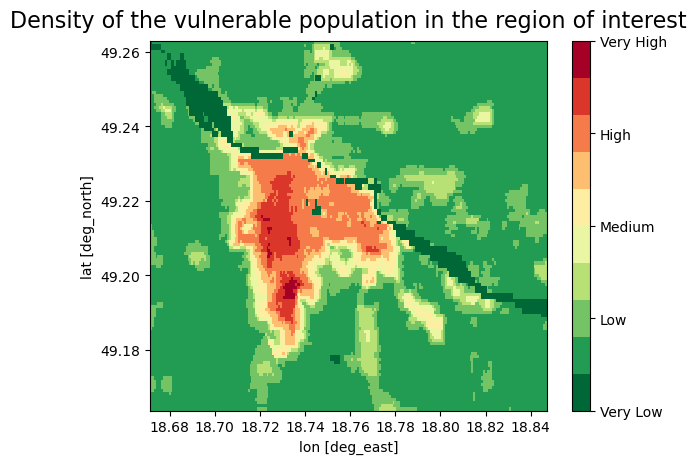
We reclassified the vulnerable population data to 5 categories (Very low - Very high) based on the density of the population, each category contains two values, because of the better sensitivity in the urban areas we decided to classify data into 10 groups
# Function to reclassify data using numpy
def reclassify_with_numpy_gt(array, bins, new_values):
    reclassified_array = np.zeros_like(array)
    reclassified_array[array <= bins[0]] = new_values[0]
    for i in range(len(bins) - 1):
        reclassified_array[(array > bins[i]) & (array <= bins[i + 1])] = new_values[i + 1]
    reclassified_array[array > bins[-1]] = new_values[-1]
    return reclassified_array

# Calculate the number of bins (classes)
num_bins = 9
# Equal interval classification
min_value = np.nanmin(pop)  # Minimum population value
max_value = np.nanmax(pop)  # Maximum population value
bin_width = (max_value - min_value) / num_bins  # Width of each bin
pop_bins = [min_value + i * bin_width for i in range(num_bins)]  # Define bin boundaries

# Define reclassification values
pop_values = [1, 2, 3, 4, 5, 6, 7, 8, 9, 10]

# Apply the reclassification function to the population data
pop_class = reclassify_with_numpy_gt(pop.values, bins=pop_bins, new_values=pop_values)

# Convert the reclassified array back to xarray DataArray for plotting
pop_class_da = xr.DataArray(pop_class, coords=pop.coords, dims=pop.dims)

# Plot the data
fig, ax = plt.subplots()
cmap = plt.get_cmap('RdYlGn_r', 10)
oa = pop_class_da.plot(ax=ax, cmap=cmap, add_colorbar=False)
cbar = fig.colorbar(oa, ticks=[1, 3.25, 5.5, 7.75, 10])
cbar.ax.set_yticklabels(['Very Low', 'Low', 'Medium', 'High', 'Very High'], size=10)
ax.set_xlabel('lon [deg_east]')
ax.set_ylabel('lat [deg_north]')
plt.title('Density of the vulnerable population in the region of interest', size=16, pad=10)
plt.show()
Plot maps of the overheated areas next to the map of vulnerable population density#
# This plots the overheated areas and population density maps
fig, axes=plt.subplots(ncols=2, figsize=(18,6))
cmap = plt.get_cmap('RdYlGn_r', 10)
# Plot a data
oa1 = lc_class_da.plot(ax = axes[0], cmap=cmap, add_colorbar=False)
cbar = fig.colorbar(oa1, ticks=[1, 3.25, 5.5, 7.75, 10])
cbar.ax.set_yticklabels([ 'Very Low', 'Low', 'Medium', 'High', 'Very high'], size=15)
axes[0].set_xlabel('')
axes[0].set_ylabel('')
axes[0].set_title('Overheated areas in the area of interest - exposure', size=15, pad = 10)
# Plot a data
oa2 = pop_class_da.plot(ax = axes[1], cmap=cmap, add_colorbar=False)
cbar = fig.colorbar(oa2, ticks=[1, 3.25, 5.5, 7.75, 10])
cbar.ax.set_yticklabels([ 'Very Low', 'Low', 'Medium', 'High', 'Very high'], size=15)
axes[1].set_xlabel('')
axes[1].set_ylabel('')
axes[1].set_title('Population density in the area of interest - vulnerability', size=15, pad = 10)
plt.draw()
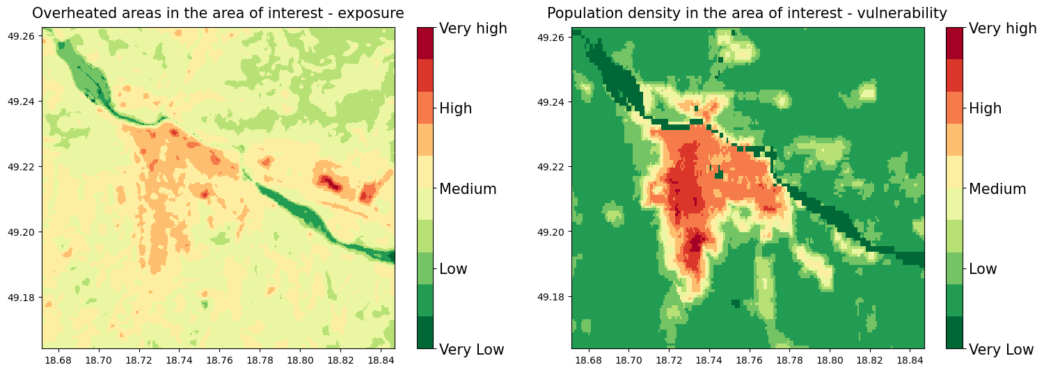
On these plots we can see the most overheated areas together with the population density of the vulnerable groups of the population
These maps were reclassified to the 10 groups, for the computation of the final Risk map based on the 10+10 risk matrix
Risk matrix sum of the places that represent the greatest risk of exposure to high temperature and vulnerable population density (Very low group is the smallest because by sum we cannot get the value of 1)
The Risk matrix will be used in the next step for the estimation of the risk severity

Save data LST and population map#
# This code saves the data to results_dir
lc_class_da.rio.to_raster(raster_path=f'{results_dir}/risk_LST.tif')
pop_class_da.rio.to_raster(raster_path=f'{results_dir}/risk_pop.tif')
Calculate the heatwave risk map#
In this step we calculate the heatwave risk map based on the exposure (LST - areas that heat up most) x vulnerability (density of vulnerable population). This risk map would then be based on historical data, and some interpretation is still needed to translate this result to future risk (see more information on this in the conclusions).
Load data and create a raster stack#
# This code creates a raster stack from risk_LST and risk_pop data, we need this step for the next processing of the data
S2list = glob( f'{results_dir}/risk_*.tif')
#
with rasterio.open(S2list[0]) as src0:
    meta = src0.meta
#
meta.update(count = len(S2list))
#
with rasterio.open(f'{results_dir}/risk_raster_stack.tif', 'w', **meta) as dst:
    for id, layer in enumerate(S2list, start=1):
        with rasterio.open(layer) as src1:
            dst.write_band(id, src1.read(1))
Calculate the risk#
We also loaded the vector layer of the critical places selected by Zilina City into the results. It is an example of how you can upload a map of the places you select as vulnerable places in your city based on your local knowledge and see if they are exposed to heat (places like hospitals, overcrowded places during the day, squares, etc.).
Note
This requires preparing your own data for the analysis. Alternatively, you can proceed without your data by skipping this step.
# This code loads the Critical infrastructure data, these data were created by the Zilina municipality office
ci=f'{data_dir}/ci_features_ZA.shp'
CI=gpd.read_file(ci)
CI_WGS=CI.to_crs(epsg=4326)
# This code calculates a risk map by multiplying a risk_LST and risk_pop data
risk=f'{results_dir}/risk_raster_stack.tif'
risk = xr.open_dataset(risk)
risk=risk['band_data']
risk=(risk[0])+(risk[1])
# Plot a data
fig, ax = plt.subplots(figsize=(12, 9))

cmap = plt.get_cmap('RdYlGn_r', 10)
oa3 = risk.plot(ax = ax, cmap=cmap, add_colorbar=False,vmin=1, vmax=20)
cbar = fig.colorbar(oa3, ticks=[1, 5.75, 10.5, 15.25, 20])
cbar.ax.set_yticklabels([ 'Very Low', 'Low', 'Medium', 'High', 'Very high'], size=10)
ax.set_xlabel('')
ax.set_ylabel('')
plt.title('Possible heat risk level to vulnerable population', size=19, pad = 14)

ci= CI_WGS.plot(ax=ax, color='blue', alpha=0.3)
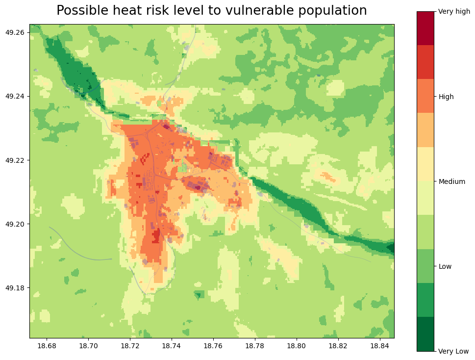
Based on the risk interpretation map (above), we can identify the places that can be most influenced by the heat (dark red) and are also populated with the vulnerable groups of the population, for better visualization, we can load a map with leafmap (below).
Save the risk map#
# This code saves the risk identification map in the results_dir
risk.rio.to_raster(raster_path=f'{results_dir}/Possible_heat_risk_level_to_vulnerable_population.tif')
Plot Risk data on the interactive map#
To see these maps on the interactive zoom in/out map with the Open Street Base map run the code below.
# This code creates a tile client from risk maps
# First, create a tile server from local raster file
riskpop = TileClient(f'{results_dir}/risk_pop.tif')
riskLST = TileClient(f'{results_dir}/risk_LST.tif')
HWRI = TileClient(f'{results_dir}/Possible_heat_risk_level_to_vulnerable_population.tif')
# This code creates ipyleaflet tile layer from that server
tpop = get_leaflet_tile_layer(riskpop, colormap='rdylgn_r', opacity=0.7, nodata=0, name='Risk population')
tLST = get_leaflet_tile_layer(riskLST, colormap='rdylgn_r', opacity=0.7, nodata=0, name='LST')
tHWRI = get_leaflet_tile_layer(HWRI, colormap='rdylgn_r', opacity=0.7, nodata=0, name='Possible_heat_risk_level')
# This code plots the results on the ipyleaflet map

# Set the size of the map
map_layout = widgets.Layout(width='1100px', height='800px')

# This code plots all loaded rasters and vectors on the ipyleaflet map
m = Map(center=riskLST.center(), zoom=riskLST.default_zoom, layout=map_layout)

control = LayersControl(position='topright')

m.add(tpop)
m.add(tLST)
m.add(tHWRI)

labels = ["Very low", "Low", "Medium", "High", "Very High"]
colors = [(0, 104, 55), (35, 132, 67), (255, 255, 191), (255, 127, 0), (215, 25, 28)]

# Create legend HTML content with custom styles (smaller size)
legend_html = "<div style='position: absolute; bottom: 2px; left: 2px; padding: 10px; " \
              "background-color: #FFF; border-radius: 10px; box-shadow: 2px 2px 2px rgba(0,0,0,0.5); " \
              "width: 75px; height: 205px; '>"

# Append legend items (labels with colored markers)
for label, color in zip(labels, colors):
    color_hex = '#%02x%02x%02x' % color  # Convert RGB tuple to hex color
    legend_html += f"<p style='font-family: Arial, sans-serif; font-size: 14px; '>" \
                   f"<i style='background: {color_hex}; width: 10px; height: 10px; display: inline-block;'></i> {label}</p>"

legend_html += "</div>"

# Create a custom widget with the legend HTML
legend_widget = widgets.HTML(value=legend_html)

legend_control = WidgetControl(widget=legend_widget, position='bottomleft')
m.add_control(legend_control)

m.add(control)

m
How to use the map: You can add or remove a map by “click” on the “layer control” in the top right corner, or “Zoom in/out” by “click” on the [+]/[-] in the top left corner We recommend first unclicking all the maps and then displaying them one by one, the transparency of the maps allows you to see which areas on the OpenStreetMap are most exposed to the heat, and in combination with the distribution of the vulnerable population, you can identify which areas should be prioritized for the application of the heat mitigation measures.
Conclusion for the Risk identification results#
The results of the risk workflow help you identify the places that are the most exposed to the effects of heat in combination with the map of areas with high density of vulnerable groups of population (based on age).
Together with the results of the Hazard assessment workflow (example for the Zilina city in the picture below) that gives you the information about the probability of the heatwave occurrence in the future, gives you a picture of the heatwave-connected problems in your selected area.
Note
To generate such a graph for your own location please go to the hazard assessment workflow (e.g. EuroHEAT methodology found here).

Important
There are important limitations to this analysis, associated with the source datasets:
The Land surface temperature data is derived from the Landsat 8 satellite imagery and data of acceptable quality (without cloud cover) is only available for a limited number of days. That means that we get limited information on the maximum LST (past heatwaves are not always captured in the images from Landsat8). The resolution of the 30x30m also has its limitations, especially in the densely built-up areas.
The world population data are available for 2020, and the distribution of the population may have changed (and will continue to change). Moreover, WorldPop data is based on modelling of populations distributions and not on local census data, therefore it may be inaccurate. Use of local data may help to reduce this uncertainty.
References#
Climate adapt (2021), Apparent temperature heatwave days [2024-06-17].
Climate adapt (2021), Tropical nights [2025-07-14].
Climate adapt (2021), High UTCI Days [2024-06-17].
European Space Agency ESA (2013), Landsat 8 satellite imagery [2024-06-20]
Utah Space University (2024), Difference between Air and surface temperature [2024-06-20]
United States Environmental Protection Agency EPA (2024), Heat Island Effect [2024-06-20]
Nazarian, N., Krayenhoff, E. S., Bechtel, B., Hondula, D. M., Paolini, R., Vanos, J., Cheung, T., Chow, W. T. L., de Dear, R., Jay, O., Lee, J. K. W., Martilli, A., Middel, A., Norford, L. K., Sadeghi, M., Schiavon, S., Santamouris, M. (2022), Integrated Assessment of Urban Overheating Impacts on Human Life, Earth’s Future, 10(9). https://doi.org/10.1029/2022EF002682
Parastatidis D, Mitraka Z, Chrysoulakis N, Abrams M. Online Global Land Surface Temperature Estimation from Landsat. Remote Sensing. (2017); 9(12):1208. https://doi.org/10.3390/rs9121208
RSLAB, Land surface temperature, based on the Landsat8 imagery [2024-06-20]